redirect you guys to my website, which has been updated today with new stuff:)xx
www.nazreenmatadar.co.uk
NAZREEN MATADAR
**
looking for a design-related job.
here's my blog full of ideas, inspiration and current progress in my work.
looking for a suitable studio space too..
hope you're inspired, or atleast admire my work*****!
All work and images are protected under copyright nazreen matadar designs ©2012
WEBSITE _ www.nazreenmatadar.co.uk
SURFACE DESIGN - ILLUSTRATION - PRINT
Thursday 22 March 2012
Wednesday 21 March 2012
Wednesday 2 November 2011
WEBSITE
HEY Everyone, once again i have REFURBISHED with some new designs, please now use my website as my new form of contact.
www.nazreenmatadar.co.uk
Speak soonxxo
www.nazreenmatadar.co.uk
Speak soonxxo
Monday 8 August 2011
HEY ALL
Hey all, thought i'd just let my viewers know my website is up and running now, needs work yet, still refurbishing but feel free to view:))
Friday 8 July 2011
2:1
Just been advised i have recieved a 2:1 in my degree - BA Hons Textiles/Surface design. Can't wait for graduation now!
Tuesday 5 July 2011
Final exhibition work in Julia Gaimsters book!!
My work has been included on this blog and the book is due to be published by Berg soon!! Yayyy
http://www.juliagaimster.co.uk/Visual_Research_Methods_in_Fashion/Blog/Blog.html
http://www.juliagaimster.co.uk/Visual_Research_Methods_in_Fashion/Blog/Blog.html
Friday 1 July 2011
New Designers - what a success!
Wednesday 8 June 2011
FINAL DEGREE SHOW 2011
So the end of the degree is near and all the work is completed. Well just about!
I recently spent a considerable amount of time in the print room, printing, steaming, ironing, drying, washing, cleaning and talking. :)
FINAL DESIGNS
# Tokyo streetstyle
Fashion - womenswear collection
I recently spent a considerable amount of time in the print room, printing, steaming, ironing, drying, washing, cleaning and talking. :)
FINAL DESIGNS
# Tokyo streetstyle
Fashion - womenswear collection
These were the pattern pieces i worked with to create the shirts (womenswear collecttion shirts... inspired by menswear). I chose a shirt which had a good fit and length, opened it apart and then altered a few bits and then came my pattern pieces...
The above is a snapshot of my current degree show work, the colours are vibrant, the imagery is bold, there is fine lines and typography but the "block colour" trend is definately DEFINATIVE in my recent collection.
The ditsy prints for tokyo work.
Mainly for collars, cuffs and the yolk.
White figures print and pink silhouette print. (Main designs)
Tuesday 3 May 2011
Current work for graduate show 2011
Ridiculously pre-occupied recently with my graduate show work. Have failed to source designers and keep myself updated globally with the stress. I've currently been working to finalise prints for my two main collections; one womenswear fashion and the other my strange interior collection.
This is some of my current progress... hmm
Fantastic design, inspired by Oliver Kugler, Kate Sutton...
A simple, yet brilliantly formatted design..
i feel there is more than can be done to it like i have tried but it seems to over complicate the design and the simplicity is stolen.
I can see this design on anything to do with design, wall hangings, sofas, cushions, ceramics, rugs, fashion garments - mens t-shirts, women's tops, absolutely amazing, it'a one of them designs that work with anything, and that can hardly be said about much of my work, i'm not sure whether thats a good thing..
One of my favourites, it seems to have instant appeal and the palette really compliments the design. Again based on Bolton town.
I have taken this into embroidery now and worked into the yellow half of the lady using black embroidery thread. I used the architecture of the BOLTON ONE building and entered that into the silhouette.
Does look interesting and adds character into my design.
I have designed this for a A0 CANVAS WALL HANGING
This is an interesting texture which has been created by CAD using my images and adding typography to my work.
I will work to have similar overlapping prints to work alongside this print.
An overall outstanding look and not to mention the very well worked palette.
This is some of my current progress... hmm
These are the two colour palettes which have inspired my current designs...
Two colour ways for the same design, i think the bottom one comes across more contemporary. The vibrant lime tone help the design stand out and catch your eye.
(Bolton town inspired prints; travel and transport)
I was working with adding my three different scenes of Bolton and then allowing them to interact with each other. Maybe i must try the whole design in one colour and see if it seems to flow better and add the extra colours elsewhere? hmm
This is Bolton one - the new transformation for Bolton, inspired print. Not at all finished but the base of the print seems to look good, i love the pattern paper texture added to the design and the bold lines which help the character of the work.
Need i not forget the colour choice - amazing
very on-trend this season, the beautiful peachy, orange
There is definitely character and interest in the painting, but i really need to find substance for it. It just seems to go best with the chosen colours, and when taken into photoshop and tweeking begins with the colours it drains out the texture of the watercolours. REALLY need to work on this, it has major potential for a brilliant design.
A simple, yet brilliantly formatted design..
i feel there is more than can be done to it like i have tried but it seems to over complicate the design and the simplicity is stolen.
I can see this design on anything to do with design, wall hangings, sofas, cushions, ceramics, rugs, fashion garments - mens t-shirts, women's tops, absolutely amazing, it'a one of them designs that work with anything, and that can hardly be said about much of my work, i'm not sure whether thats a good thing..
One of my favourites, it seems to have instant appeal and the palette really compliments the design. Again based on Bolton town.
I have taken this into embroidery now and worked into the yellow half of the lady using black embroidery thread. I used the architecture of the BOLTON ONE building and entered that into the silhouette.
Does look interesting and adds character into my design.
I have designed this for a A0 CANVAS WALL HANGING
This is an interesting texture which has been created by CAD using my images and adding typography to my work.
I will work to have similar overlapping prints to work alongside this print.
An overall outstanding look and not to mention the very well worked palette.
This is the start of my transport section of my prints - to be part of the BRITISH TRAVEL AND TRANSPORT theme. I love the water effect of the print, and the palette again seems to work excellently. I love the music notes added in for extra texture and the splashes of paint which add buckets of colour to the design. The gingham checks really work well with the texture of the print and the method used to paint each of the motifs shows quality in the work.
Overall, i am happy with the current progress made, i am most happy about my palettes and how they all seem to work alongside each other, each of the designs have an interesting look which would attract a viewer from a distance. After viewing them all, one after the other, i can see the relationship and how the ensemble can be put together for my graduate show!
Now more to do, and still not got enough of my TOKYO STREET STYLE work to put up.
Thursday 7 April 2011
inspiration/major work
Some of the artists i been looking at recently who have inspired my previous post and this weeks work..
Some AMAZING amazing talent, fantastic work and designs, if i wasn't inspired by looking at these artists then it would have been a massive suprise!
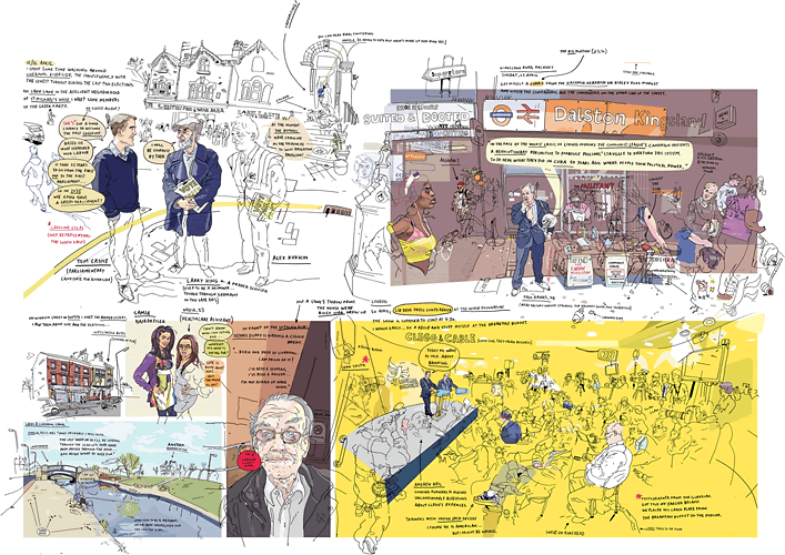
Stuggling to find things on google for some of these designers. Found them in my 'CONTEMPORARY ILLUSTRATION', amazing book. i felt these designers related alot to my current work and i used them as a constant inspiration while working.
Something i've been working on today...
REINER POSER Berlin (2007)
SUSAN CAIRNS Florence
JIM STEWART St marks square
CARA KOH Toa Payoh
NIGEL PEAKE Dundee
RACHEL OSBORN Berlin architecture
MATTHEW PHILIPS Office space
SARAH GOOCH - High street
Some AMAZING amazing talent, fantastic work and designs, if i wasn't inspired by looking at these artists then it would have been a massive suprise!
Stuggling to find things on google for some of these designers. Found them in my 'CONTEMPORARY ILLUSTRATION', amazing book. i felt these designers related alot to my current work and i used them as a constant inspiration while working.
Something i've been working on today...
I was playing with composition and structure here, finding different ways of making my work contemporary. I changed the background colour to add a quirky, eye-catching atmosphere.
Not entirely happy with any yet, but will carry on to complete a finished design.
Sunday 3 April 2011
Final Major Development
Ok, so these are a few new things i have been working on this week, still not satisfied that it's to my standard, but i think photoshop is shouting their name! so that's another to add to the to do list..
These have all been based on British travel and transport 40s-70s. I tried to concentrate mainly on the towns and this week mainly on bolton (my hometown). This is because i have decided to amalgamate my bolton one project with the final major. It makes my life much easier i guess.
So this design was one looking at the old train station in BOLTON and how the horse and carriage used to be common local transport. I used minimal colour to keep the attention on the illustrations themselves. The colour palette is one which is based on leaflets i had collected from museums from the 50s. I then recreated the colours into more modern, vibrant colours rather than the old paste-y tones.
The illustration above was completed my using two different streets of BOLTON and then using bits of colour to enhance the design. I was happy with the outcome but the proportion of the other imagery such as the cars is something which will need to be amended. The palette again has been inspired by imagery and advertisements from the previous generations and when BOLTON was once a mill town. Now it is a town which is expressed with a multi-cultural society and universities and colleges. The mills no longer exist and no textile trading is done anymore.
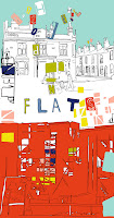
I began with the idea of using houses as silhouettes and then adding more water wash palettes mixed with gouache. I used typography in the position of the windows within terraced houses and behind painted a more modern contemporary building near our university which is a block of flats to mix both old and new buildings together through contemporary illustration.
I then added a perforated line which reads, "Drive along perforated line". This was to add humour to the design as i wanted to demonstrate how bolton has changed a lot since the 50s. cars are a common method of transport, foreign language is common now as different cultures come together in one town; Gujarati, Hindi, Urdu, English, Turkish, Polish, African and many more. The perforated line was used in apposed to a block line as there has been a break in society and people attitudes to other cultures has changed. Transport has progressed as the years have gone on and the letters flying out of cars are to represent different languages which make up a community.
more to be updated soon...
Sunday 27 March 2011
PATRICK BOYER - GRAPHIC ARTIST
ALSO... this artist seems very related to my current work. I'm trying things coming out of people, like a shout of letters coming out of a mouth, or words out of heads, very similar concept, seems to be a common trend with what i've been seeing lately.
KAI BARDELEBEN - graphic artist
fantastic live journal and good website too.
can see myself getting lost for hours in it. KAI BARDELEBEN, just <3 the colour palette and the use of photographic imagery, might be one to try this week, but hands and feet are my extreme weak point with drawing people, could just photograph bodies and then enhance them...hmm
anyway, this artist seems to have an interesting portfolio, great colour usage.. might be worth checking out :)
Subscribe to:
Posts (Atom)


